

Inspirations Behind the IPCC 6th Assessment Graphic
This blog post explores the inspirations behind the graphic used in the IPCC 6th Assessment Synthesis Report. It discusses the two other relevant figures from the WGI report and the concept used to communicate the time of reaching different global warming levels.

Ed Hawkins
Climate scientist, NCAS/University of Reading | MBE | Warming Stripes: https://t.co/RHRXsr7zE5 | Views own | Mastadon: https://t.co/m2XBxZKW5E

-
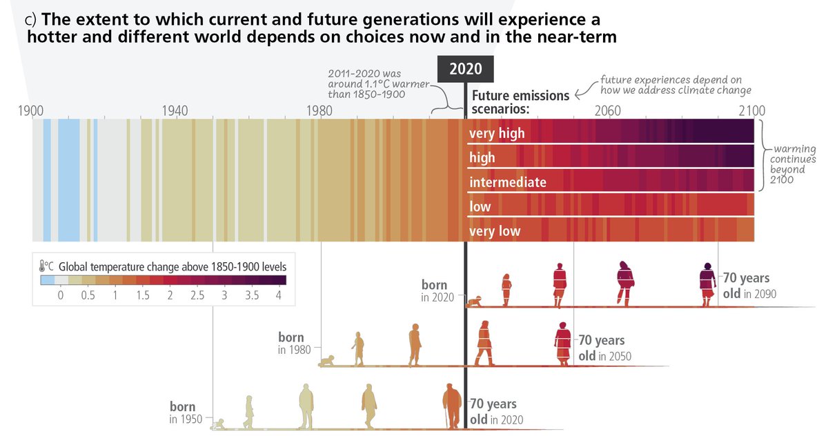
Yesterday the IPCC 6th Assessment published its Synthesis Report (SYR) which included this graphic (SYR.1c) which has been a popular way to discuss future warming in the context of different generations.
— Ed Hawkins (@ed_hawkins) March 21, 2023
What were the inspirations for this graphic?
A thread... 🧵 pic.twitter.com/TToDC7J9kn -
Within the formal IPCC process there are (at least) two other relevant figures from the WGI report.
— Ed Hawkins (@ed_hawkins) March 21, 2023
From the Technical Summary, Figure TS.6 used a similar concept but focussed the future projections component on communicating the time of reaching different global warming levels. pic.twitter.com/ztTzq8lMk7 -
As an aside, here is Figure SYR.2 which also borrows some concepts from WGI TS.6 to discuss impacts at different global warming levels. pic.twitter.com/NZFFkytWxF
— Ed Hawkins (@ed_hawkins) March 21, 2023 -
But, the more obvious link for SYR.1c is with Figure 1.25, the development of which was led by @meinshausen. This shows warming stripes back to 1750 and out to 2100, including inter-annual variations, the uncertainty in projections & emission reduction concepts. pic.twitter.com/wsJUQ0OTHC
— Ed Hawkins (@ed_hawkins) March 21, 2023 -
Obviously, Figure 1.25 was itself inspired by the original warming stripes, but... pic.twitter.com/wbYiycIj2l
— Ed Hawkins (@ed_hawkins) March 21, 2023 -
... perhaps more importantly, was also inspired by @alxrdk, who has published various versions of his 'warning stripes' here on twitter.
— Ed Hawkins (@ed_hawkins) March 21, 2023
The IPCC WGI Chapter 1 authors, with encouragement from @valmasdel & @SISeneviratne, saw @alxrdk's graphics and decided to include a version. pic.twitter.com/qBQS89C9fe -
And, going further back, the warming stripe graphics themselves took inspiration from a knitted blanket by @EllieHighwood https://t.co/hnR4e1x9QV
— Ed Hawkins (@ed_hawkins) March 21, 2023 -
But graphics also need underlying data. The observations come from the various international groups producing global temperature estimates, assessed in Chapter 2. The assessed projections are in Chapter 4, based on lots of model simulations & research on how to constrain them.
— Ed Hawkins (@ed_hawkins) March 21, 2023 -
Last, the development of the graphic used in the SYR was led by @BckgrndStories & @AlexRuane who introduced the generational icons which have helped make this version of the graphic so powerful. pic.twitter.com/eljNRtQM6s
— Ed Hawkins (@ed_hawkins) March 21, 2023 -
The development of this figure took place over several months, with numerous discussions about what aspects to include. Personally I would have liked the inclusion of some historical events for extra context, as in an earlier version I made, but these were not added in the end. pic.twitter.com/EkSyc3r2zV
— Ed Hawkins (@ed_hawkins) March 21, 2023 -
I hope this thread gives some insight into how visuals like SYR.1c are developed. There is no single point of inspiration. There is no single inventor. It is a deeply collaborative & iterative process, relying on inspiration from a wide collection of people over several years.
— Ed Hawkins (@ed_hawkins) March 21, 2023 -
One extra postscript to this thread - @BckgrndStories highlights here where her idea for the generational icons came from, before she was involved with IPCC.https://t.co/4bAujJY0qd
— Ed Hawkins (@ed_hawkins) March 22, 2023